It's always a good idea to keep an open mind! Susie discovered a number of options that were available to her at our initial consultation that she wasn't aware of – one of which was letterpress.
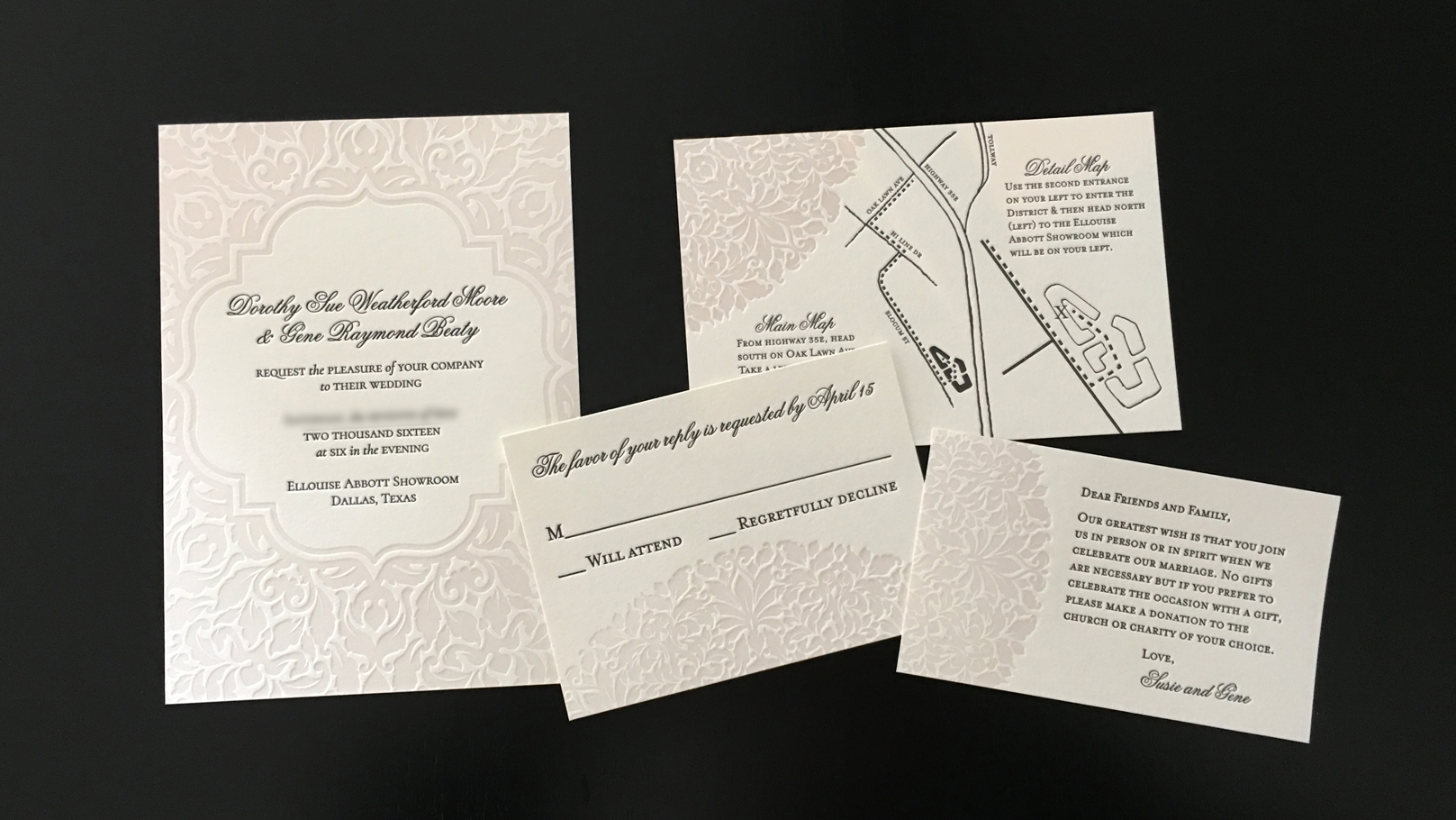
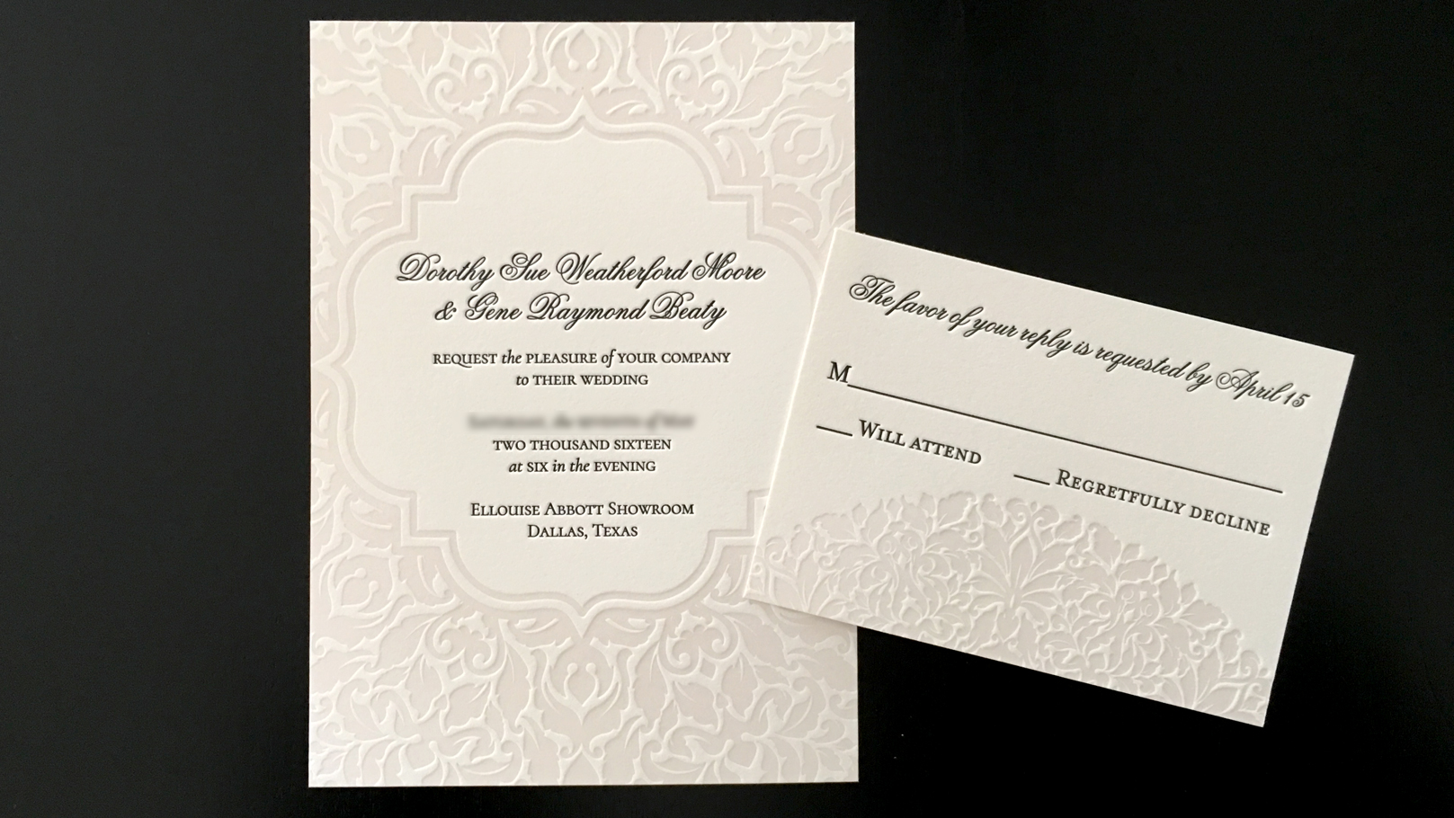
Considering the details of her event – intimate, elegant, small, formal – letterpress was the perfect choice to showcase those elements. So she started by choosing her color – a very soft, light champagne that was barely a color at all! So lovely! Next, we discussed the design itself. Other than saying she was open to ideas that incorporated "small details," she was pretty open.
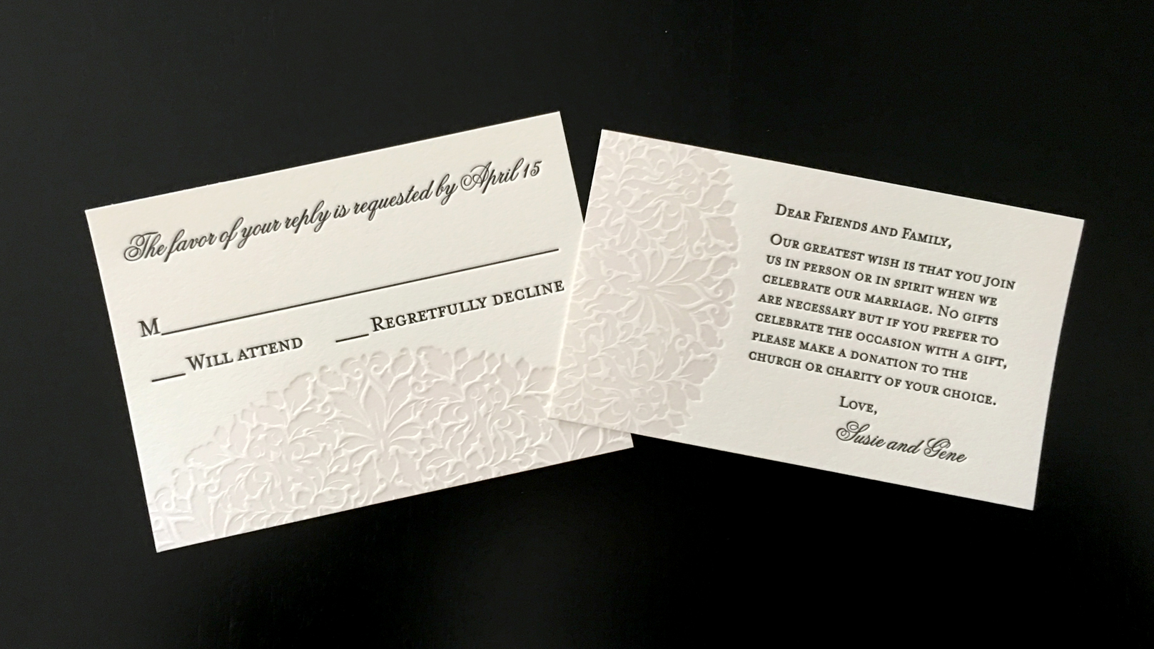
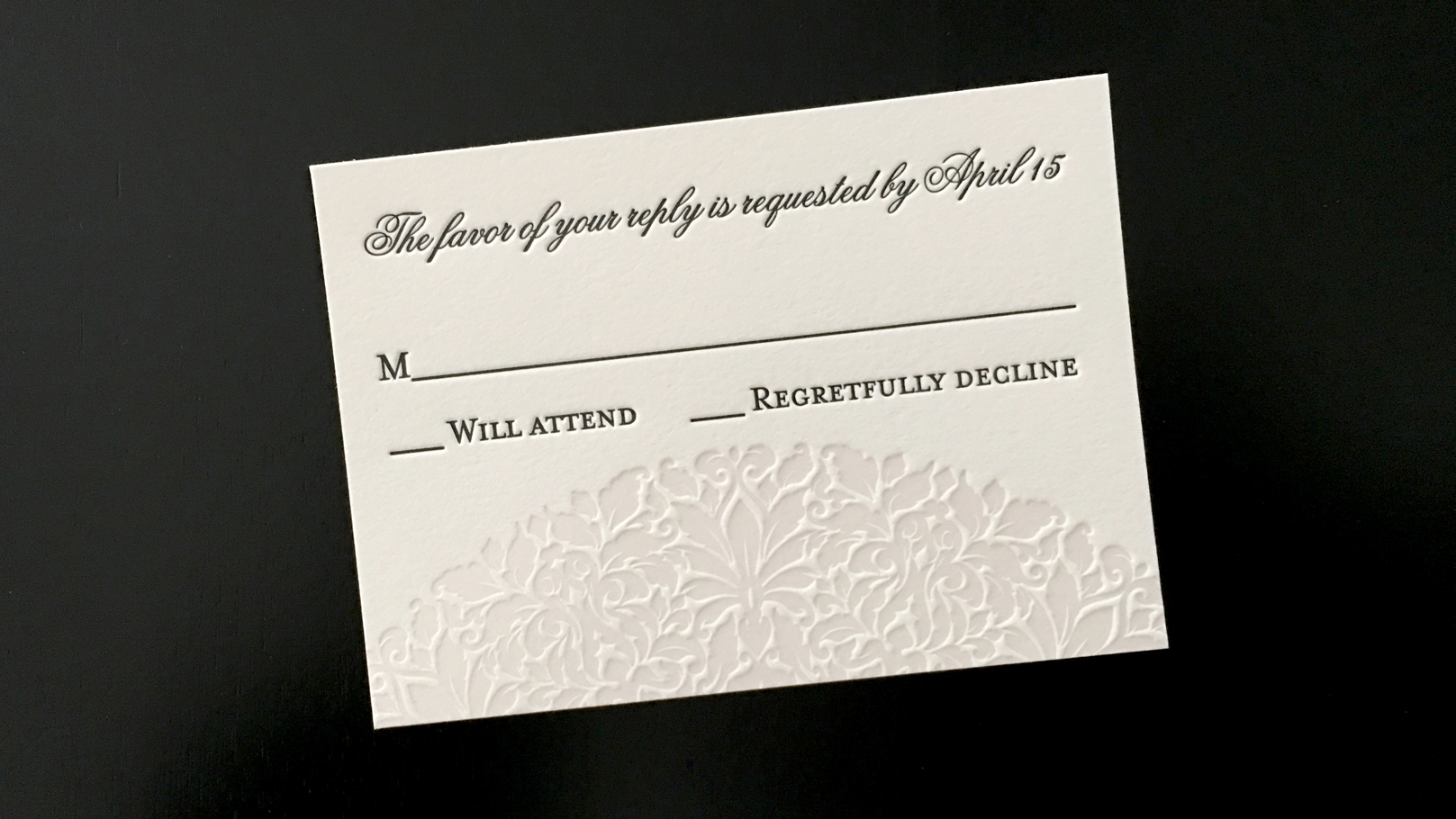
That left me with a wide range of options, to say the least! I designed about eight or ten options in all, ranging from solid subject matter to more abstract interpretations. Susie loved the above design of the invitation, the more abstract take on things, so we moved forward with the other pieces of the suite. The design of the invitation is actually a large circle with the cutout in the middle, so the other parts of the suite take advantage of the outer edges of the design. If you notice closely, the design continues from one piece to the next.
The typography is classic, formal and works very well with the suite, and the maps are hand-drawn to give a bit of personality to the piece. Yet again, my friends at We Are 1976 did a fabulous job with the letterpress work for this project – many thanks to them!